Tuesday, May 14, 2024
-
5
min
Enhancing Your Tamagui Apps: Media Queries and Animations
Welcome back to our exploration of Tamagui, a powerful tool for building fast and fluid UIs, cross-platform with React Native and Web. In our previous discussion, we laid the groundwork by introducing Tamagui's basic concepts and capabilities. Today, we delve deeper into how to make your applications more dynamic and responsive with the use of media queries and animations. This blog will guide you through the practical application of these features, helping you to create interfaces that are not only visually appealing but also adapt seamlessly across different devices. Let’s get started on enriching your user experience with Tamagui!
Note: Our example here is built on top of the basic templates created via the command: npm create tamagui.
Looking to integrate Tamagui into your project? We're here to help! Book a call here.
Media Queries
Media queries are a CSS technique used to apply styles based on the characteristics of the device viewing the content, such as screen size, orientation, and resolution. This allows developers to create responsive and adaptive designs that render optimally across various devices.
To use media queries with Tamagui, we start by setting up our breakpoints in the Tamagui configuration. There’s a set of predefined breakpoints in the template app, which we can find and adjust as needed in the following file:
packages/config/src/tamagui.config.ts
As we can see there are defined two types of breakpoints. Those based on maxWidth and those based on minWidth.
We use minWidth for the mobile-first approach. Mobile-first design starts with styling the smallest screens first and then progressively enhancing the layout for larger screens using minWidth. This means you define your base styles assuming the user is on a mobile device, and as the screen width increases, you add or override styles that make use of the additional screen space.
We use maxWidth for a desktop-first approach. Desktop-first design starts with styling for larger screens and then adjusts for smaller devices using maxWidth. This method is often used when you’re retrofitting or optimising existing desktop designs for mobile.
Now, we can use the media queries to apply different styles based on screen width. Let’s update the main template page, for example, to change the color of the title based on screen width.
Partner with Morrow to transform your Expo app into a high-performing, secure, and user-friendly solution. Fill out our Expo audit form and take the first step towards app excellence.
Inline media queries
Now, we can utilise the media queries to apply distinct styles depending on the screen width. For instance, let's update the main template page to change the colour of the title based on the screen width. This practical example will show us how to dynamically adjust visual elements to enhance user experience across different devices.
packages/app/features/home/screen.tsx
Initially, we set the default font colour to red. As the screen size increases, we progressively change the colour all the way up to white (mobile-first approach).

Programmatic Media Queries
We can also interact with media queries programmatically using the useMedia hook. This allows us to achieve the same behaviour in a dynamic and programmable way.
packages/app/features/home/screen.tsx
With our media queries set up, let's now shift our focus to adding animations to bring our Tamagui app to life.
Animations
Animations are essential for creating engaging user experiences, making UI elements not just visually appealing but also interactive and lively. Tamagui supports animations through three powerful methods, each catering to different needs and scenarios:
- CSS Animations: Ideal for simple to moderately complex animations, leveraging the familiarity and ease of CSS.
- React Native Animated Library: A robust option for more intricate animations, particularly effective in mobile environments.
- Reanimated Library via Moti: Extends the capabilities of Reanimated, providing a more powerful and flexible approach for complex animations across both web and mobile platforms.
The template app we created by default supports the React Native Animated method, and this is what we explore.
Create Animations Configurations
As a first step, we need to define animation configurations in tamagui.config.ts. Our template app already has a predefined set of animations. Let’s add our own slow animation configuration that takes 3s to finish.
packages/ui/src/animations.ts
Note that our animations utilise the createAnimations function from @tamagui/animations-react-native, aligning with our chosen animation library. Should we opt to employ other libraries, such as Reanimated or CSS as previously mentioned, we would integrate the specific functions provided by each respective package to suit our animation needs.
However, the distinctions stop there. Once we define our animations, the rest of our application remains agnostic as to which library was used to create them. This means that regardless of the animation source, their implementation throughout the app remains consistent and seamless.
(More details on the other animations can be found in the official documentation)
Using The Animations
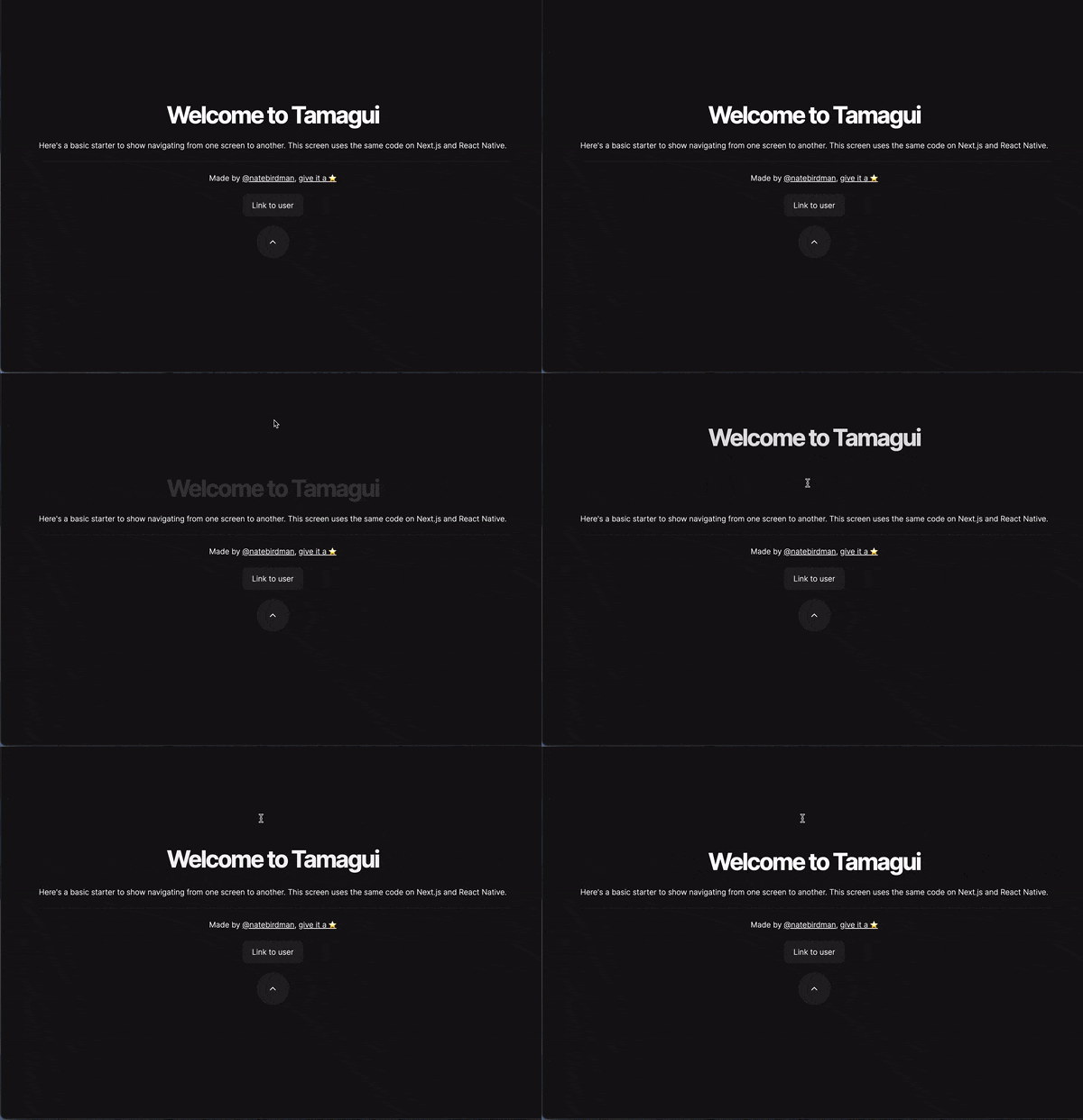
Now that the animations are configured, we can apply them to any component that undergoes prop changes. For instance, let’s animate the home page title by displacing it on the Y-axis upon a click, applying a 3-second animation to achieve this effect. This example demonstrates how effortlessly we can enhance interactivity within our app.
packages/app/features/home/screen.tsx

Note that the animation will automatically apply to any prop change with this setup. For instance, if we resize the window and the media queries we set up earlier take effect, we'll observe that the colour transition animation is also triggered. This illustrates how animations seamlessly integrate with other dynamic changes within the application.

Animation on Mount
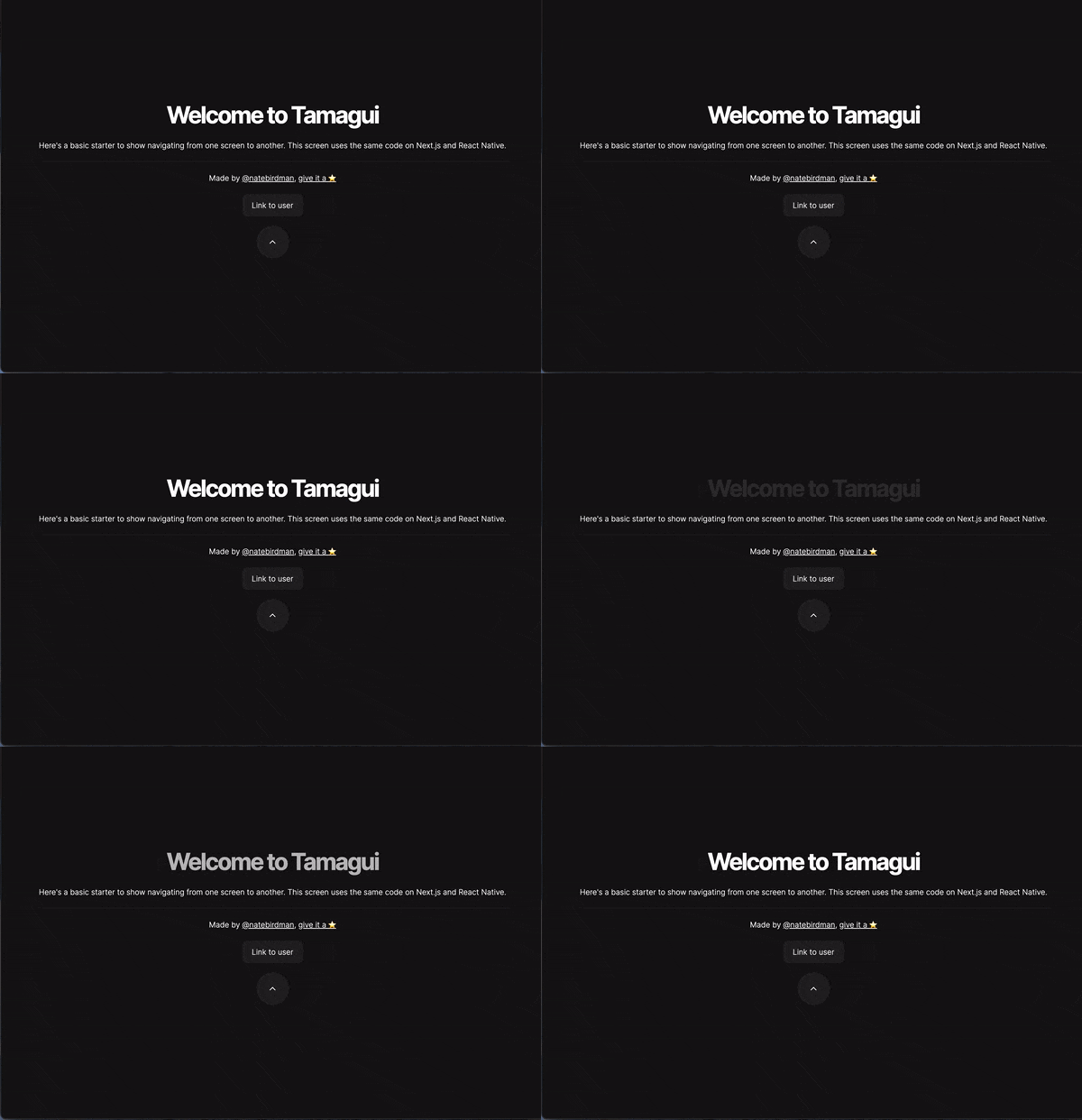
Tamagui simplifies the process of animating components upon mounting through the onEnter prop. This functionality allows for animating the props from an initial value to their default state. For example, we can make the title fade in by adjusting the opacity prop, showcasing a smooth transition as the component appears on the screen.
packages/app/features/home/screen.tsx
Note that we don’t have to define that the default opacity is 1. Tamagui is smart enough to figure it out.

Custom Animations per Prop
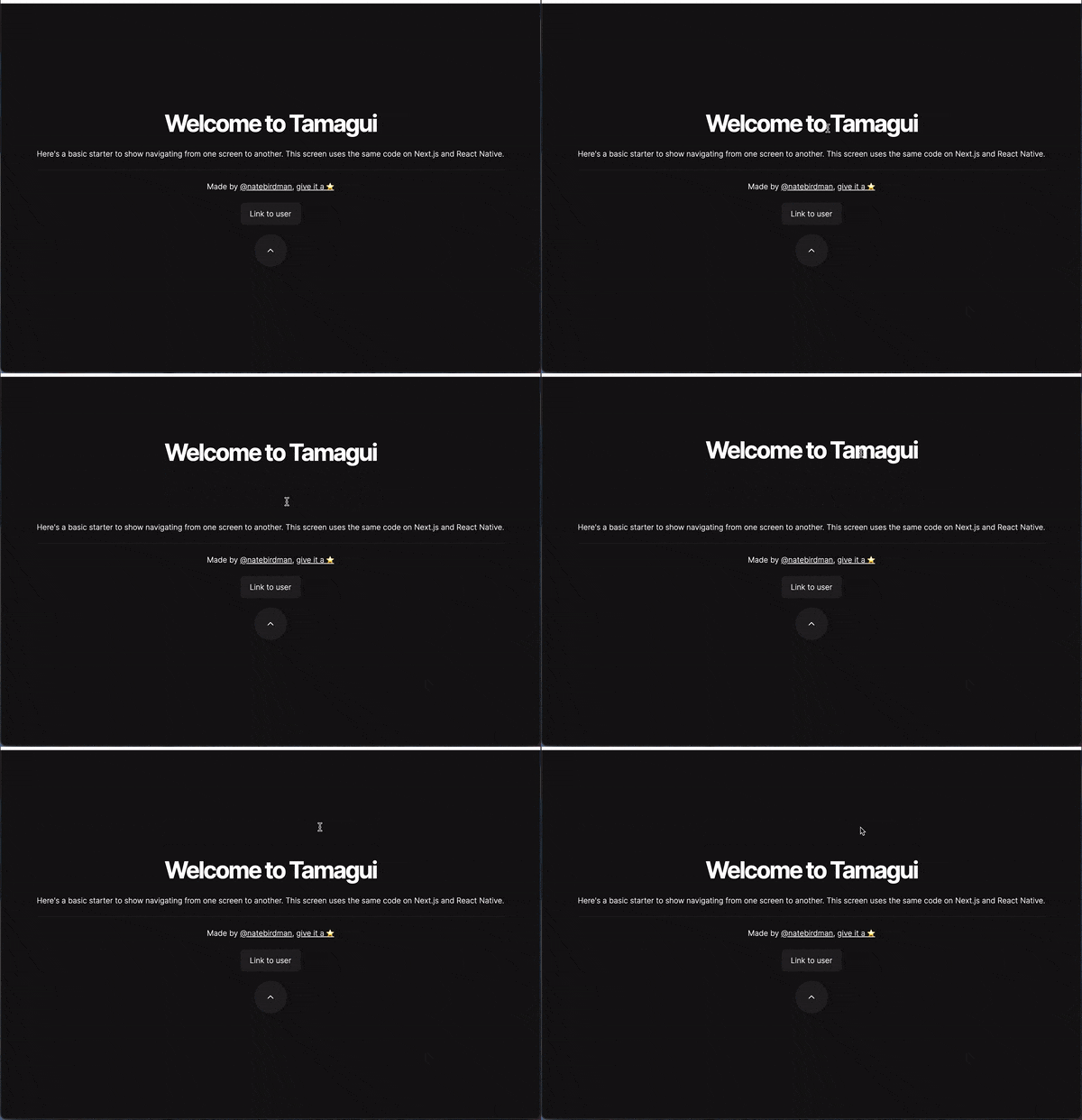
We might not always want to apply a single animation to just one property. Instead, we may prefer to animate specific props differently or set a default animation while allowing certain properties to have their own unique animations. This can be achieved using the 'array' form of the animation prop.
For instance, we can set a default 3-second animation for general changes but customise the animation of the Y position to make it more dynamic and jumpy. This method gives us the flexibility to fine-tune animations according to the behaviour we want to emphasise in each component.
packages/app/features/home/screen.tsx

Wrap up
Of course, there is much more to explore with animations in Tamagui, all of which is detailed in the official documentation.
All the animations we've discussed are compatible with both web and native apps, functioning seamlessly without any special modifications.
With Tamagui, you can quickly and efficiently build impressive universal dynamic and responsive applications.


.jpg)


